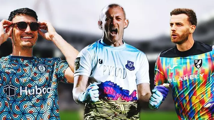
When it comes to soccer uniforms, the focus often rests on the flashy designs worn by outfield players dribbling and shooting their way across the pitch. However, it’s a disservice to overlook the equally crucial but understated role of goalkeepers, who don a distinctive set of attire designed to set them apart. Traditionally clad in straightforward, monochromatic jerseys, a significant transformation has occurred over the years, resulting in some of the most vibrant, whimsical, and sometimes bizarre goalkeeper kits imaginable. This article will delve into the kaleidoscopic world of goalkeeper jerseys from clubs around Europe, highlighting exemplary designs, styles that missed the mark, and everything in between.
Historically, goalkeeper kits have not garnered much attention; they were often plain, utilitarian pieces, typically green or black, aimed at function rather than fashion. However, the 1990s marked a turning point. During this dazzling decade, creative kits with bold graphics took center stage. Bright colors, fantastical patterns, and audacious combinations became the norm, drawing both admiration and bewilderment. Although many would agree that some of these flamboyant designs bordered on the absurd, they undeniably left a lasting impression on the sport. As we venture back into the current season, it becomes evident that despite the initial shock value of these designs, they now carry a curious charm that elicits both nostalgia and intrigue.
The Good: Exemplary Designs That Inspire
Among the standout goalkeeper kits this season is the collection from Augsburg FC, which features a striking neon diamond graphic across all versions, regardless of color. The blue and yellow options are eye-catching, but the black home kit shines with a dazzling technicolor display that evokes a vibrant energy on the pitch. Likewise, Aston Gate’s joyful blue-toned home kit captivates with a delightful tessellating pattern that suggests catchy summer vibes—a testament to design’s role in boosting team spirit.
Furthermore, international styles also shine. Namibia’s stunning patchwork jersey, inspired by the traditional textiles of the Ovambo people, employs lilac, coral, orange, and lime green in hypnotic, wavy columns. This vibrant homage to cultural heritage not only showcases craftsmanship but also situates the sport within a broader narrative of identity and tradition. Such examples elevate the aesthetic quality of goalkeeper kits while paying homage to rich histories.
Unfortunately, along with the remarkable, there are kits that leave much to be desired. Bayern Munich’s away jersey for Manuel Neuer, crafted by Adidas, evokes a “mishmash” of confusion rather than awe. The combination of overly bright colors and a chaotic pattern is visually overwhelming and fails to deliver a cohesive design. Similarly, the pink Hibernian kit, characterized by a jarring crackled graphic that resembles a crumpled paper, raises eyebrows rather than spirits.
Cologne’s attempt to pay homage to retro aesthetics through a dark blue jersey overlayed with undulating ribbons of color also misses the mark, coming off as reminiscent of outdated software designs—a look that does not align with the modern, dynamic atmosphere of football.
No exploration of goalkeeper kits would be complete without discussing some truly outlandish choices that defy comprehension. A peculiar standout is from Llanwit Major, whose jersey draws inspiration from the quintessential British dish of fish and chips. The hilariously themed outfit, with its vibrant chip-patterned shorts, brings a quirky charm while simultaneously attracting ridicule. The only logical conclusion is that the design, while certainly unique and memorable, perhaps spikes the barrage of perplexity more than admiration.
Additionally, the various clubs using a shared Nike template, such as Atletico Madrid and Liverpool, can lead to cookie-cutter kits that lack distinct visual identity. When all teams are covered under the same stylistic umbrella, the rich diversity that should characterize the sport is diluted.
As we sift through the myriad designs worn this season between the sticks, it becomes clear that the artistry involved extends far beyond trivial fashion statements. Goalkeeper kits are cultural artifacts, reflecting historical trends, club identities, and even societal motifs. From the skilled goalkeeper himself to the flashy designs, every element works harmoniously to enrich the narrative of the beautiful game.
The critique of these sublime and ridiculous kits encourages greater appreciation not only for goalkeepers and their vital position but also for the dynamic interplay of art and sport. While some designs may induce laughter or disbelief, they contribute to the colorful tapestry of soccer culture, reminding us that style and function can coexist on the pitch, ultimately bringing fans together in camaraderie and joy. Whether we love or loathe these kits, they are indelible markers of the evolution of soccer ware, awaiting thoughtful consideration and discussion.

